Interface as Material: The Liquid Glass Turning Point
For more than a decade, digital interfaces have evolved through cycles of visual philosophy. We moved from skeuomorphism, with its textures and shadows imitating the physical world, to the radical minimalism of flat design. With its new “Liquid Glass” direction, Apple is not simply introducing another stylistic layer. It is signaling a deeper transformation in how interfaces are conceived, structured, and experienced.
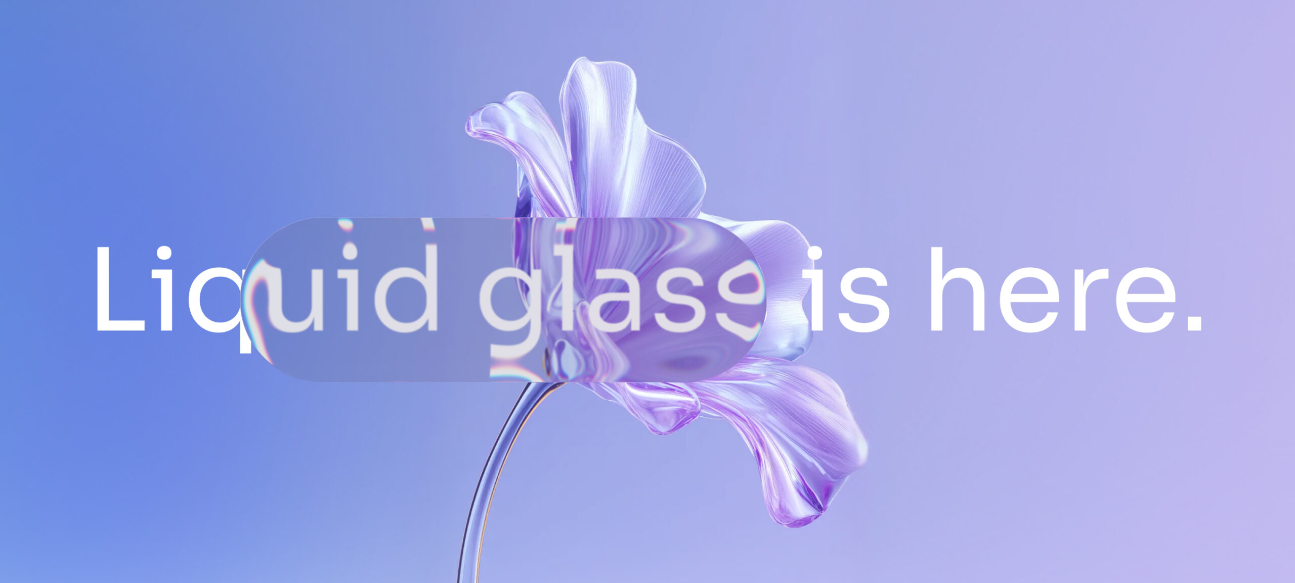
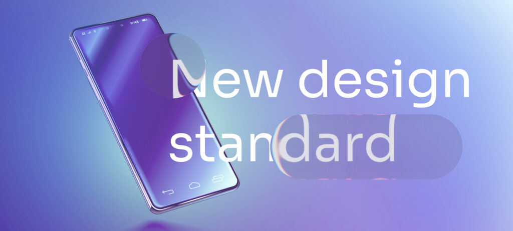
Liquid Glass reframes the interface as a dynamic material rather than a static surface. Instead of flat color blocks and rigid containers, UI elements behave like translucent layers of glass that refract, blur, and subtly respond to movement. Depth is no longer implied through simple shadows; it is expressed through light diffusion, parallax, and motion continuity. What we are witnessing is not an aesthetic adjustment, but a shift in paradigm: from designing layouts to designing materials.
This evolution has been progressively visible across recent versions of iOS and finds its most advanced expression in spatial environments such as Apple Vision Pro. The underlying logic is consistent: interfaces must feel integrated into space rather than stacked on top of content. Panels float. Navigation flows. Transitions morph instead of switching abruptly. The experience becomes fluid, almost architectural.
The paradigm shift lies in three structural transformations. First, hierarchy is no longer defined primarily by position and color contrast, but by material behavior. Translucency communicates depth. Blur communicates distance. Motion communicates causality. Second, transitions are no longer decorative micro-interactions; they become cognitive bridges that reduce friction between states. Instead of tapping and jumping between disconnected screens, users flow through transformations that visually explain what is happening. Third, this material logic prepares the ecosystem for spatial computing. By aligning mobile interfaces with principles used in immersive environments, Apple is building continuity between two-dimensional and three-dimensional experiences.
For companies operating mature mobile applications, the implications are significant. Liquid Glass exposes what could be called “experience debt.” Apps built around rigid cards, heavy blocks of saturated color, and static modal systems may suddenly feel visually and behaviorally outdated when compared to system-native components. The gap becomes particularly visible when navigation bars, sheets, and background treatments fail to harmonize with the operating system’s material logic.
Adapting is not as simple as adding blur effects. It requires revisiting design systems at their core. Component libraries must account for translucency rules, layering principles, and motion continuity. Technical stacks must support GPU-intensive rendering without sacrificing performance. Legacy frameworks or highly customized rendering engines may struggle to integrate these effects smoothly, creating tension between brand design and platform consistency. In this sense, Liquid Glass pushes organizations to modernize both their design thinking and their technical infrastructure.
There is also a strategic branding dimension. As system aesthetics grow more expressive, the risk of homogenization increases. If every application adopts the same glass-like translucency and depth rules, visual differentiation becomes narrower. Color palettes and typography alone will not be enough to create distinction. Competitive advantage shifts toward interaction design, motion identity, personalization logic, and the integration of intelligent features. In a world increasingly shaped by AI-driven experiences, the fluidity of the interface becomes a stage for adaptive behavior rather than static content.
Yet a critical perspective is necessary. Translucency and motion can enhance clarity, but they can also generate visual noise if overused. Accessibility concerns emerge when contrast ratios are compromised or when layered backgrounds interfere with readability. Glass, by definition, can obscure as much as it reveals. Without rigorous design discipline, the result may be overstimulation rather than elegance.
There is also the broader question of substance versus spectacle. The history of digital design shows that visual revolutions often risk overshadowing product fundamentals. If organizations adopt Liquid Glass purely as a trend, without aligning it with genuine user needs and strategic objectives, they may invest heavily in polish while neglecting usability, performance, or functional innovation. The true opportunity lies not in replicating aesthetic codes, but in embracing the underlying philosophy: interfaces should feel alive because they are responsive, contextual, and intelligent.
For digital leaders, this moment calls for reflection rather than imitation. Does the current design system support dynamic material principles? Is the technical architecture prepared for more sophisticated rendering and motion logic? How will the brand express itself when the operating system defines much of the visual grammar? And most importantly, how can fluid interfaces amplify the integration of AI and personalized services rather than simply decorating them?
Liquid Glass marks a turning point. It moves the industry from flat surfaces toward living interfaces, from abrupt state changes toward continuous transformation, and from purely screen-based logic toward spatial thinking. For mobile applications, this is both an opportunity and a challenge. Those who treat it as cosmetic will incur hidden complexity and limited return. Those who understand it as a structural evolution in interface philosophy can use it to create experiences that feel not only modern, but meaningfully alive.
The real shift is not about glass. It is about redefining how digital products breathe, move, and adapt within an increasingly intelligent ecosystem.